![]() Call us now:
Call us now:

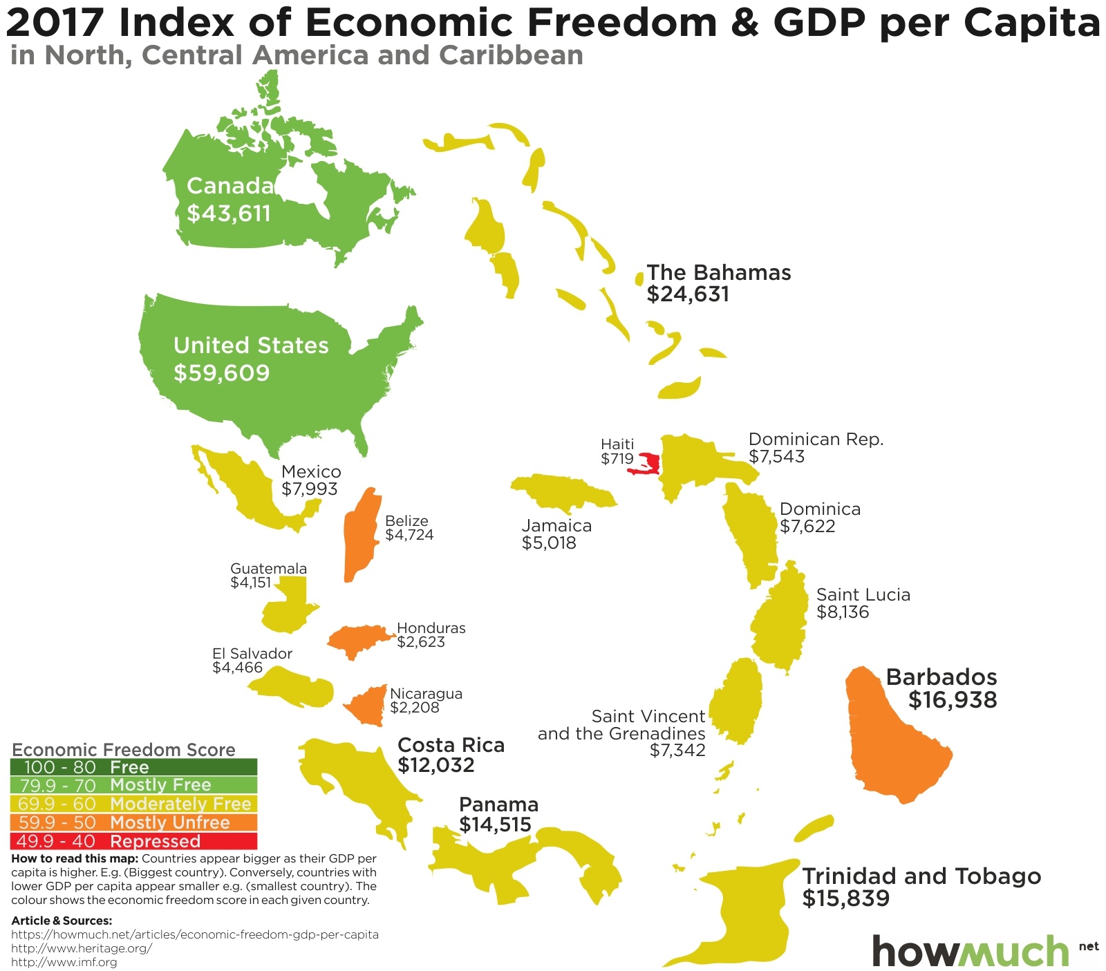
The Heritage Foundation recently came out with an updated ranking of countries’ economic freedom. Heritage is focused on creating laws that encourage economic freedom, by which they mean low taxation, open trade policies, and few barriers to start a new business. We mapped Heritage’s scores from the freest countries in the world (in green) to the most repressed (dark red). This lets you easily see the best (and worst) places to live when it comes to making your own financial choices.
Looking at a map of economic freedom for the entire world reveals distinct pockets of freedom and repression. The freest continuous group of countries stretches from the United States and Canada over to northern Europe and the Baltic countries. Russia is the only country touching the Arctic Ocean in a color other than dark and light green. Australia and New Zealand also stand out in the Pacific as bastions of freedom, especially combined with the other countries in Southeast Asia. On the other hand, almost all of South America, Africa, and Asia (at least on the continent itself) remain repressed.
Searching for patterns across the entire globe is interesting, but we thought we could take our viz up a notch and see if there are any correlations according to average GDP per capita and economic freedom. Gross Domestic Product (GDP) is a simple economic measurement for the total value of the goods and services sold in an economy. Looking at GDP per capita is not the same as average income, but it lets you quickly judge how well off the average person in that country is. So we used GDP figures from the International Monetary Fund to change the size of each country on the map—the larger the country appears, the higher per capita GDP is. There are some surprising insights you can gather from crunching the numbers like this.